This article covers some mesh optimization techniques I learnt from my school days and still use in my everyday.
First time I learnt about mesh optimization was in a class where the model was made in such a wasteful manner that optimizing resulted in less than quarter the polys. I thought to myself, this is such an exaggerated scenario. This cannot be possible in real life.
And there I was proven wrong, over and over again. With almost every game I make, I get this oddly familiar feeling during some phase of the project. And then, without knowing the teacher in me comes out.
Trying to teach everyone of efficient modeling techniques and mesh flow.
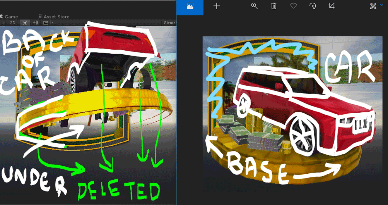
That said, with this game the Artist had already taken an approach optimize the symbols. And he was great at it too. But at the end of the project, since the impact from the mesh was still noticeable, I gave it a go too. My usual approach would start with deleting everything that’s not visible to the camera/player. Stuff, like Car interiors, base planes like underside of a table or money piles.
After deleting all unwanted faces. I start looking at the design itself. If the side view mirror of the car cannot use more than 10 pixels on the screen no point giving it more polys than of a quad or a box. Maybe a curved box at the max.


